Forum Replies Created
-
AuthorPosts
-
 SakinKeymaster
Hi Michael,
I checked on our server, and it shows it’s already activated. I will email you.
Regards,
SakinSakinKeymasterHi Glen,
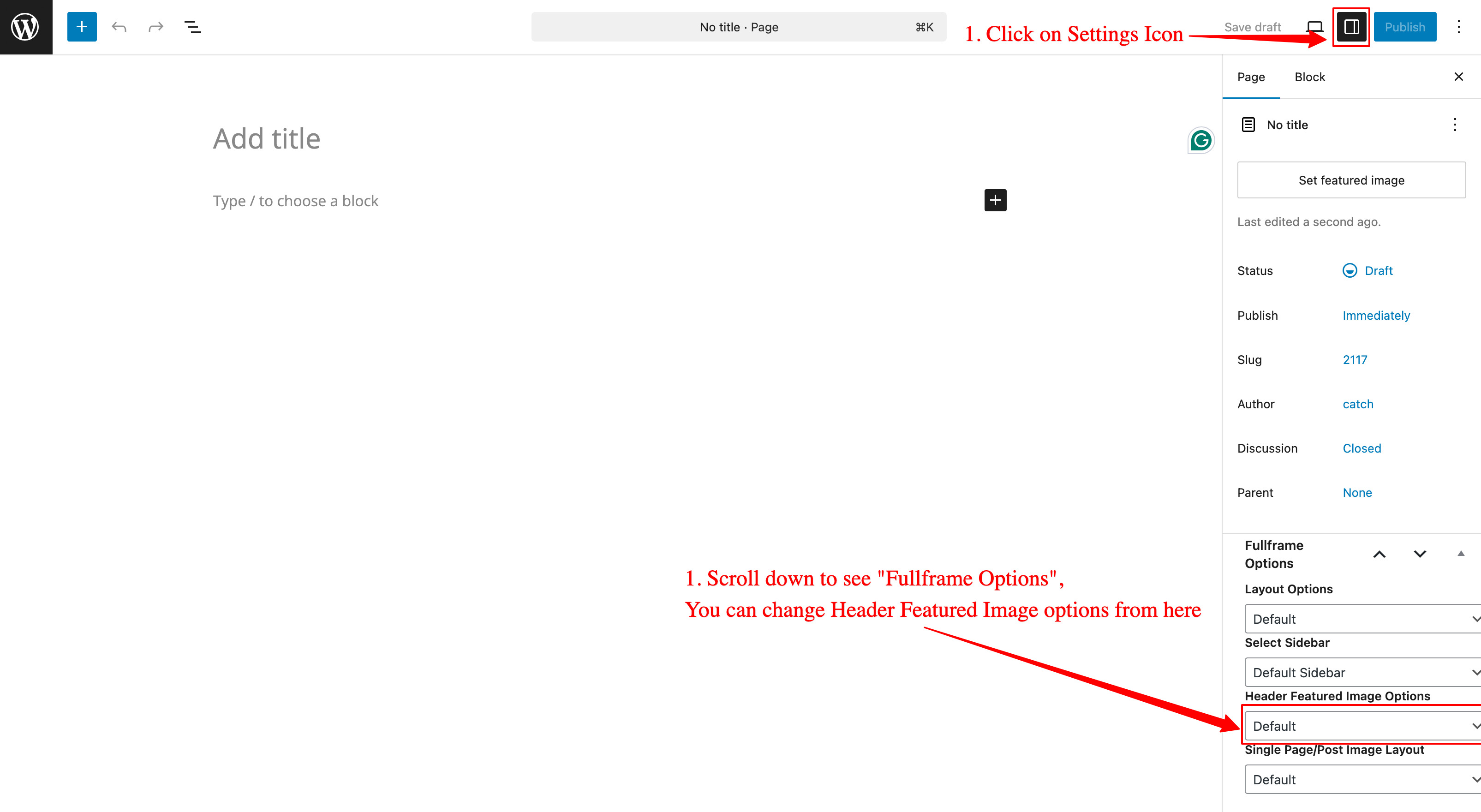
You can update to the Full Frame Pro theme, and then you can disable Header Toggle in Mobile from “Appearance => Theme Options => Fixed Header Top Options => Check to disable Header Toggle in Mobile”.
Regards,
SakinSakinKeymasterHi Thorge,
It’s still there, it’s on the settings bar. See the screenshot below:

Regards,
SakinSakinKeymasterHi Glen,
Yes, it was fixed in version 4.4.1 (Released: September 25, 2025). You can check the changelog at https://catchthemes.com/themes/full-frame-pro/#changelog . Please update the theme and clear your cache.
Regards,
SakinSakinKeymaster@wouwonline: Looks like there is an issue with your child theme. Can you active the main theme Catch Kathmandu Pro and check it?
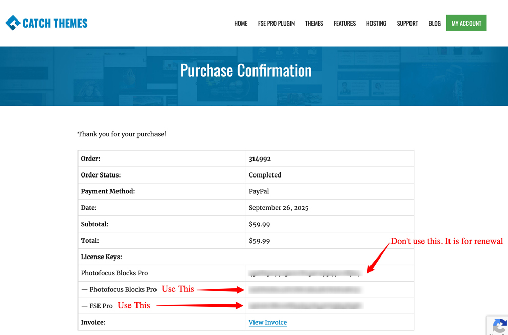
SakinKeymaster@lewiryan: Sorry for the issue. Please check your account at https://catchthemes.com/my-account/ and then click on “View Details and Downloads”. Then you will see the license keys. For bundle products like Photofocus Blocks Pro, you will see first “Photofocus Blocks Pro” key that is just a product key and don’t use it. Use the second one for the theme and the third one for the FSE Pro.
SakinKeymasterHi Glen,
Yes, we can work on that for implementing the same license key for backyardpollinator.com and backyardpollinator.ca as both are the same. For that, you need to use the contact form https://catchthemes.com/contact-us/ and let us know the license key. We will add that.
Regards,
SakinSakinKeymasterHi @pennoto:
You need to contact your hosting support and check the FS_Method and folder permissions. They should be able to fix the issue.
Regards,
SakinSakinKeymaster@pennoto: This is your server configuration issue. As this update uses a New package to allow locally hosting webfonts due to
GDPR issue as mentioned here https://make.wordpress.org/themes/2022/06/18/complying-with-gdpr-when-using-google-fonts/.So, it’s better to ask your hosting server to fix this folder permission issue.
WordPress uses FS_METHOD to determine how it interacts with the file system. If your server environment doesn’t require FTP for file operations (e.g., if PHP has direct file access), setting FS_METHOD to direct can often resolve this. Add or modify the following line in your wp-config.php file:
define('FS_METHOD', 'direct');Check this for more details https://kinsta.com/knowledgebase/constant-fs_method/
September 2, 2025 at 11:05 am in reply to: Conflict with Version 2.6 and SiteOrigin PageBuilder #341105SakinKeymaster@fireflywebs: Thanks
August 30, 2025 at 11:00 am in reply to: Conflict with Version 2.6 and SiteOrigin PageBuilder #341066SakinKeymaster@fireflywebs: We haven’t made any modifications to function with Recent Posts and News. So, it shouldn’t be a theme issue. It should be a plugin issue with the WordPress core. I am sure, if you revert back to Solid Constructions Pro version 2.5.3, you will still have the same issue.
Can you check with SiteOrigin plugin support?
SakinKeymasterHi Andrew,
Which plugin are you talking about? the order 314628 is for “Fotografie Blocks Pro” WordPress theme. When I check your website, it’s using the Latest version of Fotografie Block Pro theme.
But if you are talking about the FSE Pro plugin, then please check now. I have renewed your license key.
Regards,
SakinSakinKeymasterHello Bob,
Yes, it must be some plugin issue. You can activate a plugin “Query Monitor” https://wordpress.org/plugins/query-monitor/ and check for the error.
Regards,
SakinSakinKeymasterHello Blakely,
Thanks for purchasing the theme. Sorry, I couldn’t find your order. Please contact us at https://catchthemes.com/contact-us/.
Regards,
SakinSakinKeymasterHi Bharat,
Thanks for purchasing the theme. I have processed the refund for the extra subscription.
Regards,
SakinSakinKeymasterHello @cindy,
It might be a cache issue that you are getting an update message even after the update. Please check your cache plugin settings and clear the cache.
Regards,
SakinSakinKeymasterHi Chris,
Thanks for reporting the issue. Please update the theme, and it should work fine.
Regards,
SakinSakinKeymaster@tatyana1981: Can you post your site URL and I will check the search result on your website.
SakinKeymasterHello @hschwind:
You can renew the theme from your account.
1. First, log in to https://catchthemes.com/my-account/ page: Once you are on the My Account page, click on “View Licenses,” and you will see the status of your license
2. If your license key has expired, then you need to click on “Renew license” and check out. But if you want to renew it before it expires, then you need to click on “Extend license” and then check out.Regards,
Sakin -
AuthorPosts