Forum Replies Created
-
AuthorPosts
-
Sakin
KeymasterSo, we need ot check your child theme and website. I will contact you.
Sakin
KeymasterHi Rickpix,
Please add the following function in our child theme’s functions.php file
function bold_photography_register_polylang_strings() {
	if ( ! function_exists( 'pll_register_string' ) ) {
		return;
	}

	$mods = get_theme_mods();

	foreach ( $mods as $key => $value ) {

		// Only register clean strings
		if ( is_string( $value ) && strlen( trim( $value ) ) > 0 ) {

			pll_register_string(
				$key,
				$value,
				'Bold Photography'
			);
		}
	}
}
add_action( 'after_setup_theme', 'bold_photography_register_polylang_strings', 20 );
After you add this code. You need to go to “Appearance => Customize” and change the content which you want to translate.
For example, if you want to change Header Media Title and Site Header Text, then go to “Appearance => Customize => Header Media” and change Header Media Title and Site Header Text and click on publish. After you make the changes, it will show those strings Polylang at “Languages => Transalations”Regards,
SakinSakin
KeymasterHi Sarah,
Sorry for the issue. I will contact you to check your license key details.
Regards,
SakinSakin
Keymaster@wcmaster: I have increased the activation limit of your license from 1 site to 2 sites.
Sakin
KeymasterHello Andre,
Yes, I mean you have enabled the Header Media, but it’s missing an image. So, which option have you selected and how about the image?
Regards,
SakinSakin
KeymasterHi Paul,
The Catch Kathmandu version 4.4 was released on August 20, 2015. So, it’s already 10 years now. I am surprised at how the theme is still working on your website. There have been a lot of changes; you can see the changelog at https://catchthemes.com/themes/catch-kathmandu-pro/#changelog.
So yes, the first thing you do is to take a backup of everything.
Then, update the Catch Kathmando pro to version 5.4.2 and also update WordPress and plugins.
You will get every function moved to Theme Customizer at “Appearance => Customize”, it’s the same as theme options
You can update directly to version 5.4.2.Regards,
SakinSakin
KeymasterSakin
Keymaster@zenkeran: It’s from the Header Media, and it’s missing a header image. Go to “Appearance => Customize => Header Media”. If you don’t need Header Media, then in the “Enable on” option, you need to select “Disabled”. So, choose the option as per your need and also if you need you can add Header Media image as well.
-
This reply was modified 1 week, 1 day ago by
Sakin.
Sakin
Keymaster@qsv: For account and sales, please contact us at https://catchthemes.com/contact-us/
Sakin
Keymaster@joeb: I just tested the Section Sorter and it’s working fine on our side. Maybe you have a conflict with the plugin. I will contact you for more details.
Sakin
KeymasterHello Andrew,
Looks like you are using the old version of the Catch Evolution Pro theme. So, please renew and update the theme to the latest version 4.2.1, and it should work fine.
Regards,
SakinSakin
KeymasterHello Leona,
The Photofocus Pro theme is fully supported. You can check the changelog at https://catchthemes.com/themes/photofocus-pro/#changelog. It was last updated on December 10, 2025. If you have any issue then do let us know, and we will fix it.
Regards,
SakinJanuary 6, 2026 at 6:12 am in reply to: I can’t access the customization page of Parallax Frame Pro #342451Sakin
KeymasterHi José,
Thanks for informing, and glad to hear that it’s solved.
Regards,
SakinJanuary 6, 2026 at 2:56 am in reply to: I can’t access the customization page of Parallax Frame Pro #342449Sakin
KeymasterHi José,
Thanks for using the Parallax Frame Pro theme. Our theme update shouldn’t be an issue with access to the theme customizer. Yes, you can use the theme as per your need until any update is needed in the PHP or WordPress core.
Can you add the plugin Query Monitor https://wordpress.org/plugins/query-monitor/ and check it?
Regards,
SakinSakin
Keymaster@rodeboy: Since you are not using multiple layouts on the homepage, can you just go to “Appearance => Customize => Theme Options => Fullpage Options” and in Scrollbar option, can you check “Check to enable Scroll bar Enabling the scrolling feature will automatically disable the parallax effect on iOS devices.“
Sakin
Keymaster@kodendigital: It’s strange to see your screenshot like that. Have you tried to reverting back to version 2.1 and check it? You can see the diff from the track https://themes.trac.wordpress.org/changeset?old_path=alchemist/2.1&new_path=alchemist/2.2, it’s just the removal of the conditional script for Internet Explorer versions before 9 and WordPress 6.9 compatibility testing.
Sakin
Keymaster@kodendigital: Can you post your site URL? Looks like you are confused about the theme. When I conducted a Google search for ‘Alchemist’ theme, I found another theme from ThemeForest as well. So, can you check if you are using our theme from WordPress.org that is https://wordpress.org/themes/alchemist/, or another theme? If you are using another theme, then you need to contact the theme author’s support.
Sakin
KeymasterHello Charles,
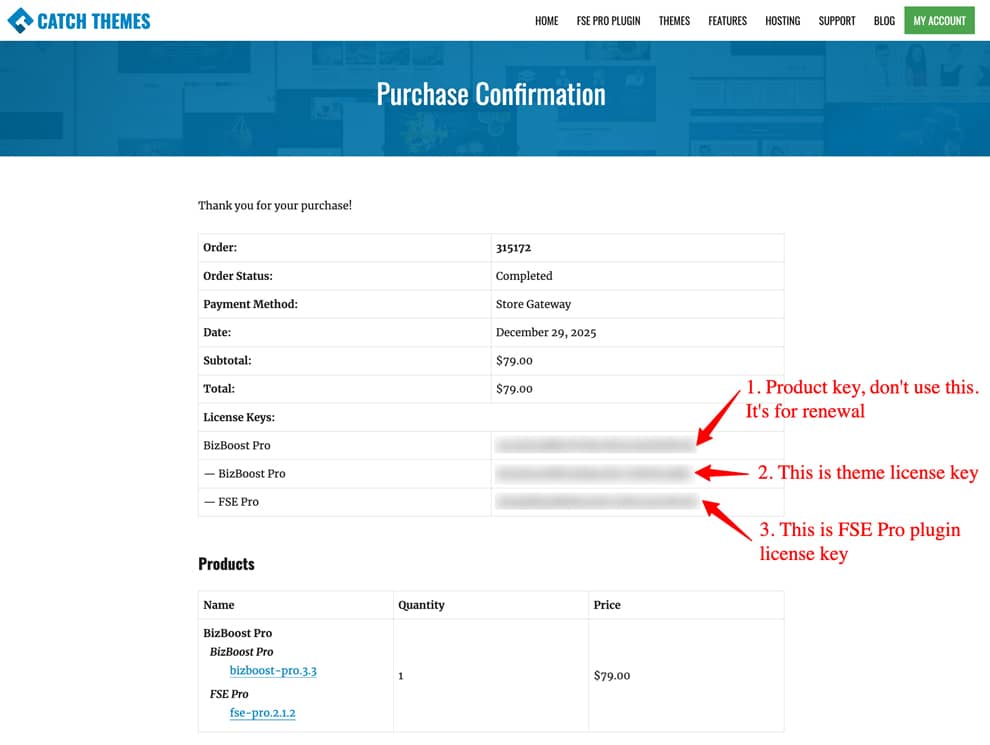
Thanks for purchasing the BizBoost Pro theme. Looks like you tried to activate the product key instead of the license key. Please check this FAQ at https://catchthemes.com/fse-faq/#question-installation-and-update-block-themes-how-to-activate-theme-license-key

If you still have issues, then do let me know.
Regards,
Sakin -
This reply was modified 1 week, 1 day ago by
-
AuthorPosts
