Forum Replies Created
-
AuthorPosts
-
Sakin
KeymasterHi Bruce,
It’s showing 1 car in your site Logo. I see https://colonialautorepairservices.com/cars/wp-content/uploads/2023/08/cropped-NEW-COLONIAL-LOGO.png. Can you send me the screenshot of your Logo at “Appearance => Customize => Site Identity”.
Regards,
SakinKeymaster@jessicamorante : Please check this update instructions at https://catchthemes.com/faq/how-do-i-upgrade-to-a-new-theme-version-if-i-have-modified-my-theme/
September 19, 2023 at 4:02 am in reply to: countdown numbers act like they are being squished #325255Keymaster@jus10hand: It’s because of the large font and size. Please add the following CSS in the “Appearance => Customize => Additional CSS” box:
@media only screen and (min-width: 103.75em) { #clock > .count-down .countdown-number, #countdown-section .countdown-number { font-size: 42px; } }KeymasterHi Per Nymo,
You can install plugins like “Header Enhancement” which will enable Customizer with the Site Identity to add Site Icon.
Regards,
SakinSeptember 19, 2023 at 2:45 am in reply to: Which file am I looking for? or is there another solution? #325246Keymaster@catwingz: We don’t have a WooCommerce template in the High Responsive theme. So, I assure you that it’s not from our theme. Please check your WooCommerce settings and also other replated plugins for that.
Keymaster@jj-weller777 : It looks like you have a configuration issue in LiteSpeed Cache plugin. So, please check the settings, clear your cache, and check it.
Keymaster@jus10hand : Please update to the latest version 1.2.9
Keymaster@jessicamorante : Please update to the latest version for updated icons.
KeymasterHi Jeff,
Yes, you can do that. For that just go to “Appearance => Customize => Menus” and then click on your Social Menu and open the link that you want to open in a new tab, in that link check “Open link in a new tab” and click on “Publish”.
Regards,
SakinKeymasterHi Jeff,
You need to active your license key on your site and then update the theme from your dashboard. Please check this instructions at https://catchthemes.com/faq/how-do-i-upgrade-to-a-new-theme-version-if-i-have-modified-my-theme/
Regards,
SakinKeymasterHi Issac,
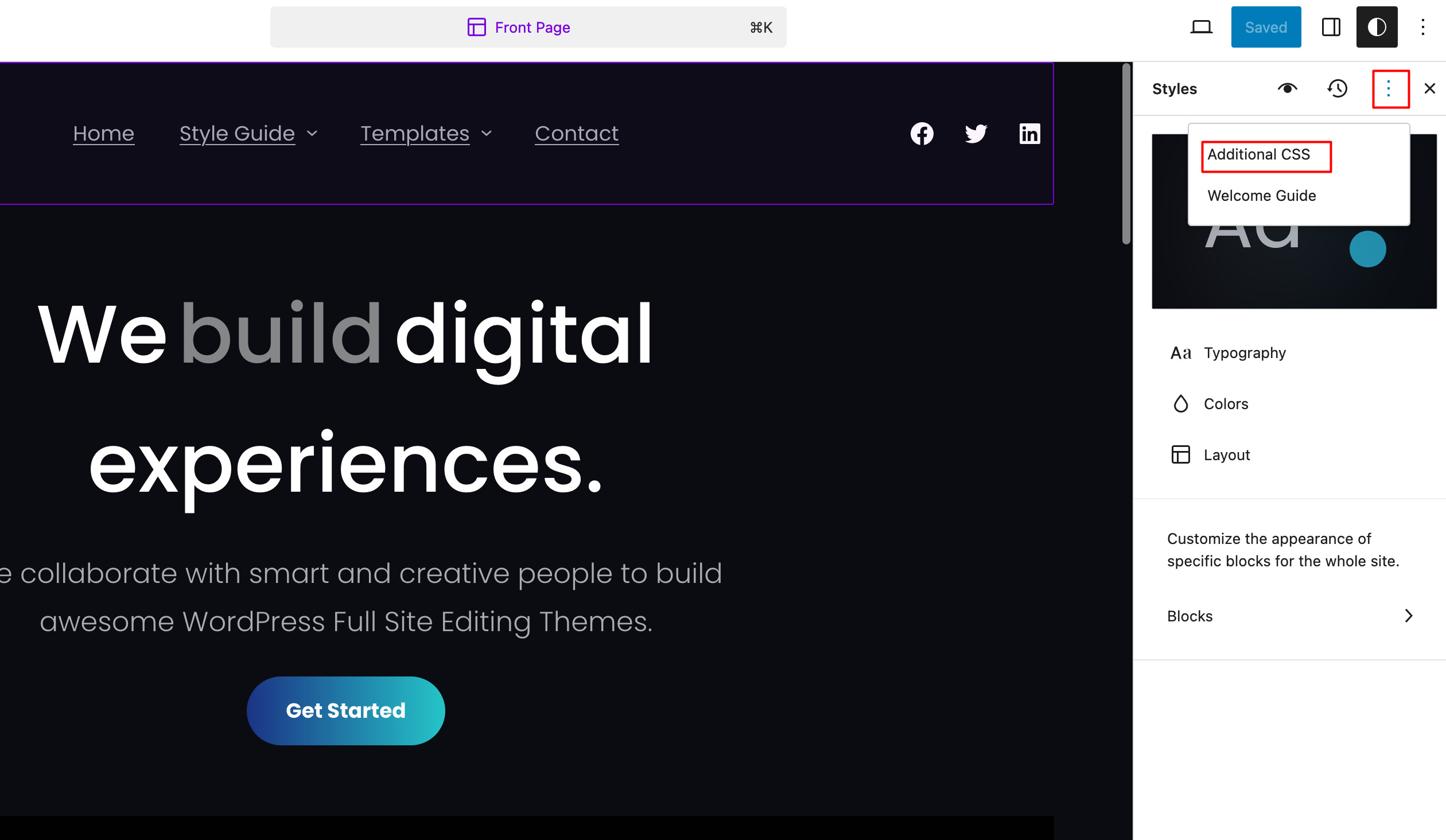
For block themes, yes you can add Custom CSS from “Appearance => Editor => Styles” and then Click on the three dots icon on Style Panel and click on “Additional CSS”.
See this image for the Style Panel:
Regards,
SakinKeymasterHi Jeff,
We have just updated the My Music Band Pro to include the TikTok icon. So, please update the theme and clear your browser cache and chceck it.
Regards,
SakinKeymasterHi Dragos,
The color options are there in the Pro version. So, I recommend you upgrade to the pro version for more color options as well as other features. You can check the compare table at https://catchthemes.com/themes/visanti-pro/#compare
1. For Header Media Title:
You can change the color code in the following CSS and add it in the “Appearance => Customize => Additional CSS” box:.has-header-image .custom-header-content .section-title { color: #111111; }2. For Header Media Subtitle
You can change the color code in the following CSS and add it in the “Appearance => Customize => Additional CSS” box:.has-header-image .custom-header-content .section-subtitle { color: #0b57e3; }3. For the submit button on the contact page.
You can change the background color and color code in the following CSS and add it in the “Appearance => Customize => Additional CSS” box:.entry-content .wpcf7-form input[type="submit"] { background-color: #0b57e3; color: #ffffff; }Regards,
SakinKeymasterThanks Dirk.
Keymaster@markuskempus: I checked your site on my computer and it’s not showing any spaces below the footer. Can you clear your browser cache and check it. Also, check in other computers as well.
If it still show then can you let me know which browser are you checking it from?
KeymasterHi Ben,
Bizboost is a Corporate Block theme with front-page.html which controls the front page. So, you need to edit the front page template and edit it there.
Regards,
SakinKeymasterHi Marta,
1. I just checked your site and see that you have already updated the theme to the latest version 1.0.3 and now your date issue has been fixed on your site.
2. That line is there even in our demo but we have a margin gap in between. But I don’t know why on your site there is no gap. So, you can add the following CSS in “Appearance => Customize => Additional CSS” to remove that line:@media screen and (min-width: 48em) { .wp-block-section.wp-block-most-popular-news .wp-block-query.most-popular-query .wp-block-post-template > li::after { border-right: none; } }Regards,
SakinSeptember 10, 2023 at 12:13 pm in reply to: countdown numbers act like they are being squished #324704Keymaster@jus10hand: Can you post in your site URL and then I can check it. You can eliminate space by adding Custom CSS.
KeymasterHi Issac,
You can make the mobile menu to the left by adding the following CSS in the “Appearance => Customize => Additional CSS” box:
@media screen and (max-width: 1199px) {
  .wp-block-template-part .wp-block-main-header .wp-block-navigation {
    margin-left: 0;
  }
}
Regards,
SakinSeptember 8, 2023 at 7:55 am in reply to: Header image pixelated / custom header alt is pixelated #324603KeymasterHi Brindl,
The recommended Height is 1920px and the Width is 1080 for a Custom Header image. But it’s flexible and can be used any size. So, can you post in your site URL and let me check why it’s not working on yours? You can just replace the image from “Appearance => Customize => Header Media” and in Header Image, click on “Add New”.
Regards,
Sakin -
AuthorPosts