Tagged: catch fullscreen, images
- This topic has 11 replies, 3 voices, and was last updated 6 years, 2 months ago by
 tikaram.
-
AuthorPosts
-
December 1, 2019 at 12:25 am #227902
 brunoricoMember
First of all, thanks for your great work.
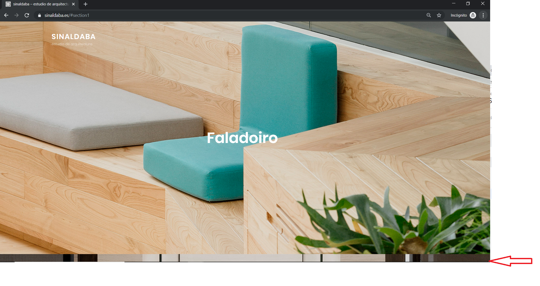
I’m trying to adapt your theme to my friend study https://www.sinaldaba.es
I’ve got an issue and I can’t find the solution: the first time I load my site, I can see the second at the bottom of the site
If I resize the window, I it fits ok…Can you help me? It’s like the image of #post2 is cropped and overlapping the #post1… so the #post1 background image does not all the height.
I’m triying hard to learn but I can’t get this work properly
http://www.sinaldaba.es/wp-content/uploads/2019/11/Catchfull-screen-bottom.png
Thanks in advance,
BrunoThis is the css personalization I made:
.entry-date {display:none;}

#search-toggle-right {display:none;}

.entry-meta{display:none;} .entry-meta{display:none;} .entry-date {display:none;}

#search-toggle-right {display:none;}

 .navigation-classic #search-toggle-right,

        #search-toggle.menu-toggle {

                display: none;

        }
.fluid-layout #header-content, .boxed-layout #header-content .wrapper,
.site-primary-menu.toggled-on,
#tertiary, footer-menu-wrapper,
.site-footer {
/* background-color: #2b2b2b;*/
margin: 2em 0em 2em 0em;
background-color:transparent;
border:none;
border-style:hidden;
border-image:none;
border-width:0px;
box-shadow: none;}
/*Remove flechitas*/
div#fp-nav.fp-right {display:none;}/*menu single post*/
.single-format-standard.wp-embed-responsive.ect-post.fluid-layout.navigation-classic.no-sidebar.content-width-layout.excerpt-image-top.primary-menu-left.no-header-media-text.site-primary-wrapper-menu-disabled.no-featured-slider.desktop-nav-on-page-right.mobile-nav-on-header div#page.site header#masthead.site-header div#header-wrapper div#header-content div.wrapper div.site-header-main div.site-branding
{text-align:center;margin-left:auto; margin-right:auto;
display:block;}.single-format-standard.wp-embed-responsive.ect-post.fluid-layout.navigation-classic.no-sidebar.content-width-layout.excerpt-image-top.primary-menu-left.no-header-media-text.site-primary-wrapper-menu-disabled.no-featured-slider.desktop-nav-on-page-right.mobile-nav-on-header div#page.site header#masthead.site-header div#header-wrapper div#header-content div.wrapper div.site-header-main div.site-branding div.site-identity p.site-title
{/*background-color:transparent;*/
background-image: url('/wp-content/uploads/2019/11/sinaldaba-arquitectos-logo-single-post-100x.png');
background-repeat: no-repeat;
/*background-size: cover;*/
background-position:center;
height:4em;
border:none;
border-style:hidden;
border-style:none;
box-sizing:content-box;
box-shadow: none;}
.single-format-standard.wp-embed-responsive.ect-post.fluid-layout.navigation-classic.no-sidebar.content-width-layout.excerpt-image-top.primary-menu-left.no-header-media-text.site-primary-wrapper-menu-disabled.no-featured-slider.desktop-nav-on-page-right.mobile-nav-on-header div#page.site header#masthead.site-header div#header-wrapper div#header-content div.wrapper div.site-header-main div.site-branding div.site-identity p.site-title a{color:transparent;}
/*single post site description*/
.single-format-standard.wp-embed-responsive.ect-post.fluid-layout.navigation-classic.no-sidebar.content-width-layout.excerpt-image-top.primary-menu-left.no-header-media-text.site-primary-wrapper-menu-disabled.no-featured-slider.desktop-nav-on-page-right.mobile-nav-on-header div#page.site header#masthead.site-header div#header-wrapper div#header-content div.wrapper div.site-header-main div.site-branding div.site-identity p.site-description{display: none;}/*esconder menú mobile*/
#header-content > div > div > div.site-primary-wrapper
{display:none;}/*sombra menu superior en single post*/
div#page.site header#masthead.site-header div#header-wrapper.header-top div#header-content div.wrapper div.site-header-main{border:none;border-style:none;}.fluid-layout #header-content, .boxed-layout #header-content .wrapper,
.site-primary-menu.toggled-on,
#tertiary, footer-menu-wrapper{border:none;border-style:hidden;border-style:none;}/*otros test*/
/*
#header-content {border-style:none;border:none;}
.fluid-layout #header-content, .boxed-layout #header-content .wrapper {
-webkit-box-shadow: 0px;
box-shadow: none;
}*/
December 1, 2019 at 2:18 am #228130tikaramMember@brunorico: The issue is due to the custom css you have added on your site as you have hidden a lot of sections. Don’t you want to add a menu or navigation later on your site. Let me know and then I will help you with custom css.
Regards,
TikaramDecember 3, 2019 at 5:43 am #228372brunoricoMemberHi @tikaram,
I don’t want a visible menú. All I want is the logo and I love the effect it mekes when you scroll down.
I’m looking to have a site where images are main content and you can access the detailed info clicking on the title of the post.
All of this is almost achieved… but I have a problem with the background images overlapping (as the menu is transparent, I can see the images overlapping at the bottom).
If I change the window size (resizing it with the mouse) it works ok and the images re-scale properly…It’s like if the first time I load the site, the size of the screen doesn’t ackoweledge the size of the navigation direction bar… and then it overlaps the images… It’s like I need to add a +1em somewhere to the backround image to fit the size… (or delete from somewhere…) but I’m searching and I can’t find it.
again, thanks in advance,
BrunoDecember 3, 2019 at 6:07 am #228378tikaramMember@brunorico: Login to your WordPress admin section and add the following additional css.
#fullpage .section, #feature-slider-section .hentry {
		min-height:100vh;
}
Let me know if this helps resolve your issue.
Regards,
TikaramDecember 5, 2019 at 3:50 pm #228687brunoricoMemberYes!!
I only had to add some top-padding on the post titles because, on mobile, the post title positioned themselves under the menu bar.div > div > div.entry-content-wrapper {
/*margin-top:20em;*/
padding-top:15em;
}I’m still triying to get the correct value, but you help us a lot. Thank you!!
BrunoDecember 6, 2019 at 12:02 am #228708tikaramMember@brunorico: Glad to know that the issue has been resolved. Let me know if you have any more issues.
Regards,
TikaramApril 26, 2020 at 6:14 pm #244229bekzMemberHi
Amazing themeI had the same problem as brunorico mentioned above
I did all the same and it worksat first load the post titles are positioned well as I wanted
but after scrolling down and returning back to first section the title is moved on top
and this happens only on mobileI double confirm with the site provided by brunorico, https://www.sinaldaba.es
he has the same issueCan you refer to his site, cuz mine is not up yet ?
thanks in advance
April 27, 2020 at 3:19 am #244295tikaramMember@bekz: Are you using the Pro version or the free version of the theme?
Regards,
TikaramApril 27, 2020 at 9:18 am #244376April 28, 2020 at 3:04 am #244501tikaramMember@bekz: Have you tried adding the additional css that I have provided in the previous reply. Please let me know.
Regards,
TikaramApril 28, 2020 at 7:15 am #244575bekzMemberYes I added this css :
#fullpage .section, #feature-slider-section .hentry {
min-height:100vh;
}and also:
div > div > div.entry-content-wrapper {
/*margin-top:20em;*/
padding-top:15em;
}After adding first block of css it really makes the background full to the screen
but titles appear to be shifting after scrolling down and back to the first sectionApril 29, 2020 at 1:45 am #244718 -
AuthorPosts
- The topic ‘Background Image not fitting ok’ is closed to new replies.