Forum Replies Created
-
AuthorPosts
-
Sakin
KeymasterHi Juul,
WordPress doesn’t show the EXIF date as default. You need a custom code or plugin for that. You can check this article https://www.wpbeginner.com/plugins/how-to-add-exif-photo-tags-in-wordpress/
Regards,
SakinSakin
KeymasterHello @staceymoeevents:
Sorry, that issue was fixed on November 2022 and then again Instagram change it back last week. So, we are appealing to the Instagram team to unblock the app and waiting for their answer.Sakin
KeymasterHi Stephanie,
I just checked your account and see that the license key is used on your test site like
box5634.temp.domains. I have deactivated the license key from that site. Now, can you try to add it to your site?Regards,
SakinSakin
KeymasterHi @staceymoeevents,
This is not a theme issue. It’s the “Social Gallery and Widget” plugin issue with Instagram changes. So, we are not sure if it will be fixed or not. Please looks for other Instagram plugin.
Regards,
SakinSakin
KeymasterHi Glen,
It cannot be done with the CSS. You can only do it using custom codes in Child Theme. So, first, you need to build child theme and then update the
lucida_featured_image()function.Regards,
SakinSakin
KeymasterHi Richard,
Yes, you can add the following CSS
.navigation-classic .site-branding {
  margin-top: 0;
  margin-bottom: 0;
}
If you further want to reduce more then add the following CSS as well:
.site-header-main .wrapper {
  padding-top: 0;
  padding-bottom: 0;
}
Regards,
SakinSakin
KeymasterHi Glen,
A) Yes, if you select the category then the post from that category will be displayed. I just check your site and it’s showing just 3 of them on the homepage.
B) Yes, that also controls the Post Page. So, if you want seperate then please use as “Featured Content”. Go to “Appearance => Customize => Featured Content”, select “Homepage / Frontpate” on “Enable On” options, select “Cateogry” on “Type” option and then select “Categories” as per your need in “Select Categories”. In this way you will have seperate posts for homepage and all other in post page.Regards,
SakinSakin
KeymasterHi Richard,
If you want to change the Background color of the header section then change the color code in the following CSS and then add it in the “Appearance => Customize => Additional CSS” box:
/* Change Header Background Color */
.absolute-header .site-header {
	background-color: #000;
}
But if you just want to change the Background color of the header menu section then use the following CSS instead of the above CSS:
/* Change Header Menu Area Background Color */
.absolute-header .site-header-menu {
	background-color: #000;
}
Note: You can check color codes at https://htmlcolorcodes.com/
Regards,
SakinSakin
KeymasterHi Glen,
Only the header image will be clickable not the video or media. You can see the title “Featured Header Image Link URL”.
Regards,
SakinSakin
KeymasterThat was just an example of CSS, you need JS to change it. So, as mentioned earlier you need to hire a customizer for this.
Sakin
KeymasterHi William,
Sorry that required custom JS and measuring the height of the footer and then adding CSS accordingly. So, it requires custom work and you need to hire a customizer for this.
For Example: If you are sure about the height of the footer then you can use the following CSS:
/* For Sticky Footer */
@media screen and (min-width: 1024px) {
	#content.site-content {
		margin-bottom: 650px;
	}
	.site-footer {
		display: block;
		position: fixed;
		bottom: 0px;
		margin-bottom: 56px;
		left: 0px;
		width: 100%;
		z-index: -1;
	}
}
Regards,
SakinSakin
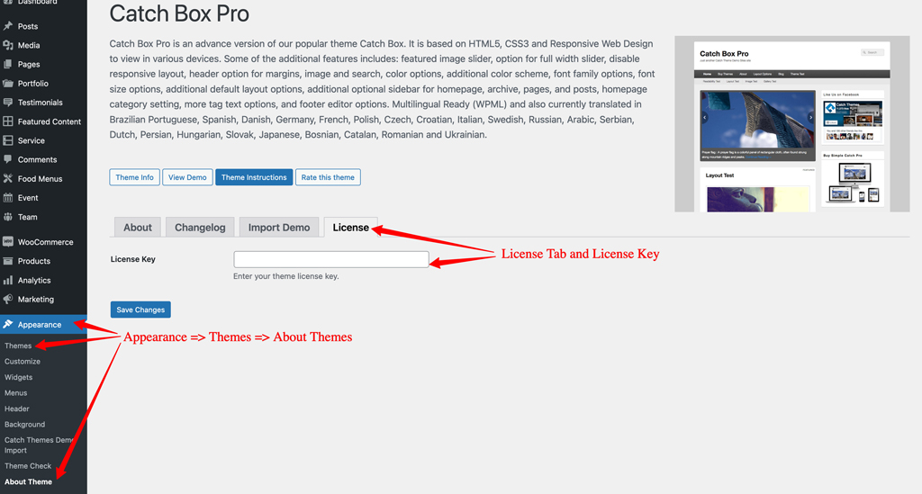
Keymaster@bigoslesli: Are you using a really old version of the Catch Box Pro theme before the license key was introduced then you will not see it. If that is the case then you need to use the manual update, please check the instruction “UPDATING THEME BY UPLOADING ZIP FILE” as mentioned in https://catchthemes.com/faq/how-do-i-upgrade-to-a-new-theme-version-if-i-have-modified-my-theme/
Then you should see the license key section like this

Sakin
Keymaster@stephvogue: You can manage your license from your account at https://catchthemes.com/my-account/
Sakin
KeymasterHi Stephen,
You can add the following CSS in the “Appearance => Customize => Additional CSS” to remove the underline from the Cover block image.
.wp-block-cover a {
	text-decoration: none;
}
Regards,
SakinFebruary 17, 2023 at 5:31 pm in reply to: template.php issues: “Warning: Attempt to read property “______” on null #315861Sakin
KeymasterHi Carey,
I just check the Clean Education Pro theme and didn’t find any issues. Also, the file mentioned is from the WordPress core and not from the theme. So, there might be a plugin or configuration issue. Can you try deactivating the plugin and check it.
Regards,
SakinSakin
KeymasterHi Heinz,
Welcome and if you like the theme and our support then I have a quick request: could you please leave an honest review? https://wordpress.org/support/theme/catch-fse/reviews/#new-post. Your review will help others know what to expect when they’re looking for the support I offer. Even a sentence or two would be hugely appreciated.
Regards,
SakinSakin
KeymasterHi Galenfea,
Welcome and if you like the theme and our support then I have a quick request: could you please leave an honest review? https://wordpress.org/themes/bold-photography/reviews/#new-post. Your review will help others know what to expect when they’re looking for the support I offer. Even a sentence or two would be hugely appreciated.
Regards,
SakinSakin
KeymasterHi Hermann,
For the column block with the background color, you can adjust the padding as per your need in the following CSS and then add it in the “Appearance => Customize => Additional CSS” box:
.wp-block-column.has-background { padding: 10px }Regards,
SakinSakin
KeymasterHi Galenfea,
Please check the Theme Instructions tab on Theme Page at https://catchthemes.com/themes/bold-photography/#theme-instructions, from there you can download the demo file zip file.
Regards,
Sakin -
AuthorPosts
