Forum Replies Created
-
AuthorPosts
-
Debbie
Participant🙁 That messes up the home page … leaves a space between the slider and the promotion … I think I probably just have too many css tweaks and can’t get them all to play nicely together. Thank you for trying though; I really appreciate your help!
Debbie
ParticipantThanks so much … I have shrunk the truck, but the fixed height for the slider messes up too many other things. No worries, I’ll figure out some other solution.
Thanks!
DebbieDebbie
Participant1. Correct, the slider is only on the home page … the issue is with the promotion image getting cut off at the top on pages other than the home page and on landscape mobile.
2. So weird that it looks fine now, but you are right. No more issues on this point.
Debbie
ParticipantYeah, that’s not good.
Is there a way to move the promotion title or description to below the button? I only use one or the other, not both, so I’m thinking maybe I can co-opt one of those for my needs. My root issue is that I have two sites that really need to have announcements over the slider because we are finding that repeat-users often don’t scroll down.
Debbie
ParticipantThis is still an issue. Any suggestions?
Debbie
ParticipantAny advice on my last reply?
Debbie
ParticipantVery, very close now.
1. When you are on a page other than the home page (which has the featured slider), the image in the promotion is slightly cut off at the top. Actually, I just checked the landscape view on mobile … it is cut off quite a bit there. Might have to do with my logo … let me know if I need to create a new topic for this.
2. When you shrink the width of the page so that the left/right sections of the promotion are stacked, the left section only takes up the width specified by “#promotion-message .left” css you gave (which does fix the look for when the left/right sections are next to each other). This is especially odd-looking on mobile devices.
Here’s the relevant additional css I have so far. Note that I adjusted the width from 75% to 60% and I’m also including the logo css in case that is related to the image getting cut off. Let me know if you need to me to post all my additional css. Thanks!
/* Fix problem with left/right Promotion Headline widgets */
.section.left {
float:left;
}
.section.right {
float:left;
}
.promotion-button.roll-button.more-button {
margin-top:10px !important;
}
#promotion-message .left {
width:60%;
}/* Shrink logo when scrolled */
.float-header #site-logo img {
width: 200px;
transition: all 0.5s ease;
}Debbie
ParticipantIt’s closer, but the text and image are in the left 75% of the headline and the right 25% is blank, even though I have the image in the Promotion Headline Right section. I’ve tried changing the Promotion Headline Left Section Width, but that doesn’t seem to help.
Also, I’d like a little more spacing between the subheading and the button. And once the image is in the right 25% of the Promotion Headline, it should be centered (it might be automatically … I’m just mentioning it now so you’ll know what I’m looking for).
Thanks!
Debbie
ParticipantI’m using the Clean Business theme, not the Fabulous Fluid theme. But I’m way ahead of you … I left a review several months ago. 🙂
https://wordpress.org/support/topic/another-great-theme-from-catchthemes-great-support/
Debbie
ParticipantPerfect — thanks!
Debbie
ParticipantThank you, that worked beautifully!
I have a related question but will post it separately.
Debbie
ParticipantSounds good. Thanks!
Debbie
ParticipantPerfect. Thanks so much!
Debbie
ParticipantYes, that worked. It still shows white for a moment if you scroll down and then up sort of quickly … is that easy to get rid of? If not, no worries.
Debbie
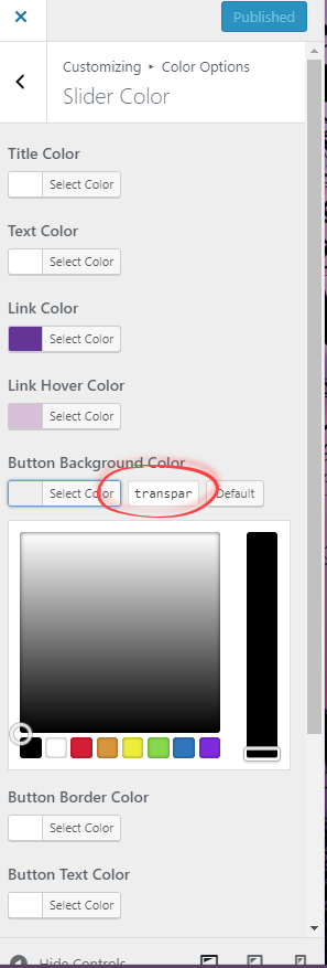
ParticipantFor example, under Customize > Color Options > Slider Color, the default Button Background Color is transparent:
 (example from whythereyouare.com).
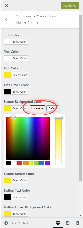
 But if you change it to something else (as I did on miboxdallas.com), then if you try to set it back to transparent, it won’t let you. I have tried both pressing the Default button next to the color, which gets this:
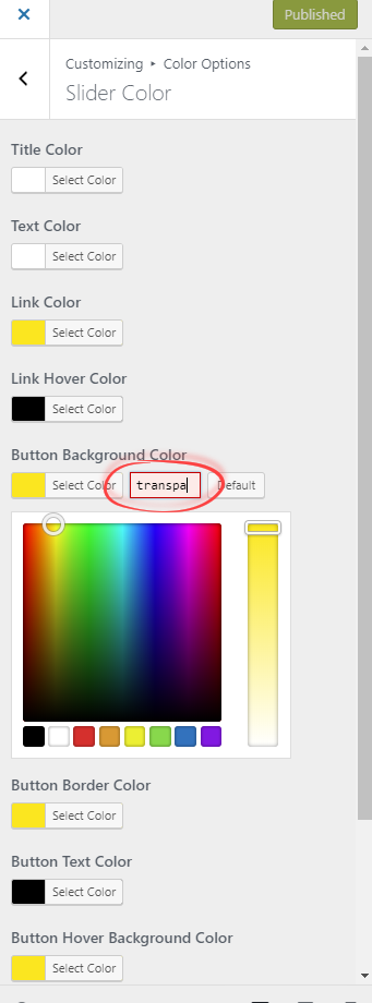
 and copying-and-pasting the value from a color that has not been changed from transparent to the color I want to change to transparent, which gets you this:
I know I can do it in Customize > Additional CSS, but that means having to figure out the right CSS selector to match the color option I want to set to transparent.
December 27, 2017 at 9:30 am in reply to: Featured slider: disable text from sliding in from the right #128716Debbie
ParticipantYes, that worked perfectly. Thanks!
Debbie
ParticipantSounds good. Thanks!
December 5, 2017 at 8:34 am in reply to: Disable/hide site title and tagline if scrolled or shrink header area #127454Debbie
ParticipantPerfect. Thank you!
Debbie
ParticipantYay!
Debbie
ParticipantAwesome! Approximately when do you think the next update will be (e.g. in a few days, a couple of weeks, …?
-
AuthorPosts
