Forum Replies Created
-
AuthorPosts
-
 sujapatiKeymaster
You’re absolutely right. WordPress already uses responsive images through srcset and sizes, allowing the browser to select the appropriate image size without separate desktop and mobile setups.
In this case, PageSpeed is reporting the 1024*819 image because the current sizes attribute indicates the image may occupy the full viewport width (100vw). So, the issue is with the sizing information rather than the lack of responsive-image support.
Regards,
SujapatisujapatiKeymasterThanks for reaching out.
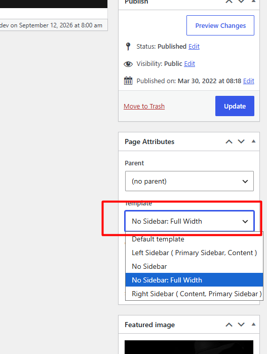
It looks like you have selected the “No Sidebar: Full Width” template for those pages. Please switch the template to “No Sidebar”, and the content will be displayed within the standard content width.
You can change this by clicking the “Edit Page” option in the admin bar to open the Site Editor. On the right side, you will find the “Page Attributes” panel, where you can change the page display layout.
Please refer to the attached screenshot for guidance.

Feel free if you need any further assistance.
Regards,
SujapatisujapatiKeymaster@Cindy: Thanks for reaching out.
Catch Responsive Pro supports responsive images, allowing WordPress to serve an appropriate image size based on the display dimensions. However, the theme does not automatically convert images to WebP or AVIF.
The PageSpeed warning indicates that the image being served is larger than its displayed size. You can use any free online image optimization tool to convert images to WebP or even compress jpg/png files to reduce their file size.Regards,
SujapatisujapatiKeymaster@Rebecca: Thank you for your query, and we apologize for the inconvenience.
Currently, we do not have an option to show or hide the Search and Cart icons in the ‘Header Right Menu’. This option is available for the ‘Primary Menu’, as mentioned in the theme documentation.
However, if you do not need these icons, you can hide them by adding the following CSS:
.site-header-right-wrapper .secondary-search-wrapper,
.site-header-right-wrapper .site-header-cart-wrapper {
   display: none;
}
Please copy and paste this code into the ‘Additional CSS’ and save the changes.
We hope this helps. Please let us know if you need any further assistance.Regards,
SujapatiAugust 28, 2026 at 7:00 am in reply to: Euphony Blocks Pro causes critical error after activation #344290sujapatiKeymaster@Eva: We have updated the theme to resolve the issue. You will receive a notification about the new update soon. Please update the theme to the latest version, and the issue should be resolved.
Thank you for your patience and understanding.
Regards,
SujaptiAugust 26, 2026 at 2:27 am in reply to: Euphony Blocks Pro causes critical error after activation #344263sujapatiKeymaster@Eva:
The function inblock-filters.phpthat you mentioned is working properly without any errors on our server. It is also the same function used in the free version of the theme, which you confirmed is working properly on your site.We would therefore suggest checking whether any additional plugins are installed or activated on your site that could be causing a conflict with the Pro version.
Regards,
SujapatiAugust 23, 2026 at 7:00 am in reply to: Euphony Blocks Pro causes critical error after activation #344243sujapatiKeymaster@Eva: Thank you for bringing this to our attention. Our team is currently looking into the issue and checking the theme and related components to identify the cause of the critical error.
We will update you shortly.
Regards,
SujapatisujapatiKeymaster@Alex:
Thank you for sharing the details. We have checked the Catch Fullscreen theme on our server and tested it across both desktop and smaller screen sizes, including different mobile devices. The fullscreen layout appears to be functioning correctly on our end.Could you please share a screenshot or the URL where you are experiencing the issue? If so, please share a screenshot or the URL where you encountered the issue, so we can investigate it in detail.
Regards,
SujapatisujapatiKeymasterHi Clara,
Thank you for reaching out, and welcome to Catch Themes!
Yes, you can subscribe to individual forum topics to receive email notifications whenever there are new replies. Simply click the ‘Subscribe’ button on the topic or forum page you’d like to follow. Once subscribed, you’ll receive email notifications for new activity.
Additionally, when posting a new topic or replying to an existing one, you’ll see a checkbox labeled “Notify me of follow-up replies via email” below the query form. Make sure to check this option so you’ll receive email notifications for any follow-up replies and won’t miss any updates.
Regards,
SunilsujapatiKeymaster@Rockpix: Please add the following CSS to align vertically center for the Hero content.
.hero-content-wrapper .hentry-inner {
    align-items: center;
}
Regards,
SunilsujapatiKeymaster@Airport Taxi:
Thank you for reaching out. We tested your site on multiple devices and browsers, and the mobile navigation menu appears to be working correctly on oure end. The menu opens and functions as expected.
We would suggest clearing your browser cache and testing the website on another mobile device or browser to see if the issue persists.Regards,
SujapatiJune 22, 2026 at 1:39 am in reply to: Side bar no longer shows up in the customize panel in Catch Responsive Pro #343844sujapatiKeymaster@cindy: Glad we got it sorted out. Feel free to reach out anytime if you need any assistance—We are happy to help.
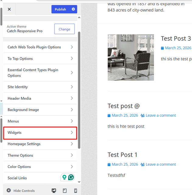
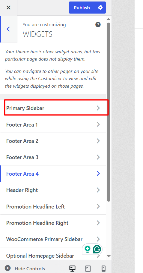
June 19, 2026 at 12:49 am in reply to: Side bar no longer shows up in the customize panel in Catch Responsive Pro #343834sujapatiKeymaster@cindy: Sorry for the inconvenience.
Please navigate to “Customizer => Widgets => Primary Sidebar”. From there, you can edit the sidebar section as needed.
For your convenience, please refer to the image below for guidance.
Regards,
SunilsujapatiKeymaster@tomdkat: We apologize for the inconvenience you’re experiencing. Our development team is aware of the issue and is currently working on a fix.
The improvement will be included in an upcoming update. Thank you for your patience and understanding.Regards,
SujapatisujapatiKeymaster@Marcel: Thanks for the query. You can add metadata manually in your theme by adding the code shown below. However, it is recommended to use a child theme so your changes are not overwritten when the parent theme is updated.
add_action('wp_head', function () {
    if ( is_front_page() && is_page( 'your-slug' ) ){
        echo '<meta name="keywords" content="homepage">';
    }
});
Alternatively, if you are using Catch Web Tools, you can add the meta tag directly from the plugin. Go to “Catch Web Tools => Webmaster Tools” and paste your meta tag in the appropriate field under the Webmaster Tools tab, then save the changes.
Best Regards,
SujapatisujapatiKeymasterHello @Marcel,
We’re pleased to hear the issue has been addressed successfully. If you’re enjoying the theme and are satisfied with our support, we’d like to ask a small favor: would you consider leaving us a review?
https://wordpress.org/support/theme/clean-enterprise/reviews/#new-post
Your feedback helps others understand the quality of support we provide and assists them in making informed decisions. Even a brief review of a sentence or two would mean a great deal to us. Thank you for your support!
Kind Regards,
SujapatisujapatiKeymaster@Marcel : Thanks for the query. To reduce the font size of the top menu on your site, please add the following CSS under Customizer → Additional CSS:
.site-primary-menu ul li a {
    font-size: 14px;
}
You can adjust the font size value as needed.
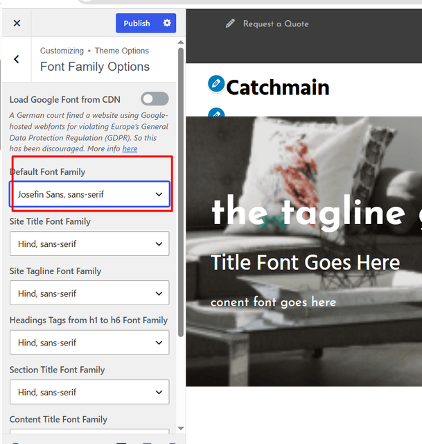
Regarding the font family for the menus, the menu font does not inherit the font family settings used for content titles or section titles. Instead, it uses the theme’s Default Font Family setting. You can change it from: “Customizer → Theme Options → Font Family Options → Default Font Family ”
Please refer to the screenshot below for reference.
As for the Featured Slider, it also uses the same default font family setting mentioned above. Therefore, changing the “Default Font Family” will affect both the menu and the slider text. Please see the screenshot below for more details.
Please feel free if you need any additional help.
Regards,
SujapatisujapatiKeymasterWe checked your site and found that the post link shows the correct date, while only the featured image URL displays a date one day earlier on hover. This might appear to be generated separately by an image-related plugin.
Could you please check whether any image optimization, lazy load, CDN, cache, or thumbnail-related plugins were recently added or updated?
Regards,
SujapatisujapatiKeymasterThis could happen due to the site’s timezone settings.
Please check your timezone settings under ” Settings => General => Timezone ” in your WordPress dashboard and make sure it matches your local timezone.
Regards,
SujapatisujapatiKeymaster@ts997:
At the moment for the free version of the Catch Base Free theme does not include a built-in option to display the search icon in the mobile header like the desktop version.
However, you can achieve this by adding custom CSS to your site. This will allow the search icon to remain visible in the mobile header. Please add the below CSS to your site.@media screen and (max-width: 990px) { .nav-primary, .nav-header-right, .nav-secondary, .nav-footer { display: block; position: static !important; } .nav-footer, .nav-primary .menu { display: none; } #search-toggle { position: absolute; right: 0; top: 14px; margin-right: 10px; } .site { position: relative; } #search-container { bottom: auto; } }Regards,
Sujapati -
AuthorPosts