Forum Replies Created
-
AuthorPosts
-
Nancy
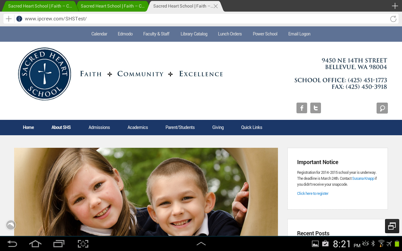
ParticipantThanks. Site: http://www.sacredheart.org/School
Participant1. Yes, I know. But if you forget and use the old one you lose everything. The option to save changes should be disabled.
2. Yes, I know how to edit the footer. The question is referring to the Webmasters Tool footer code section. I was previously give this code to help with a touch issue:<script type=”text/javascript”>
// Open menu on first tap on touch devices.
jQuery(document).ready(function () {
jQuery(“.menu-item”).has(“ul”).children(“a”).attr(“aria-haspopup”, “true”);
});
</script>3. Fixed my own issue. I missed a few of the custom css settings that I lost the resized columns, removed boards, and etc. Once I added these back in, the things are behaving as before.
4. Previously, the search box in the widget was just the icon and you clicked on it and it expanded. Just different than it was before.
5. Ok. I’ve done a few modifications that let’s me accomplish what I wanted.ParticipantOne last question. Can I do custom social media icons?
October 24, 2014 at 11:54 am in reply to: Custom CCS to change margin in widget – one section only #46259ParticipantThank you! That did the trick.
Another related question. Is there anyway to make that image track to be the same height as the slider image? I’ve made by graphic the same height as the box and things align nicely when things are full size. As screen size gets smaller, I’d like to be able to have box size as well. Maybe there needs to be a mini slider widget item.
ParticipantPerfect. That works great. I almost had it right.
ParticipantThe site I am trying to do this one is – http://lisaotooleforjudge.com. Post 303 is the one I’d like inline.
ParticipantYour welcome! Just passing along what you gave me a couple of weeks ago. 🙂
ParticipantTry this in the custom CSS section:
/* Featured images in summary view left inline with text */
.blog .entry-summary .wp-post-image,
.archive .entry-summary .wp-post-image {
display: inline;
float: left;
margin: 0 10px 10px 0;
border: 0;
}ParticipantOn Android, the Giving menu drops down but I can’t select any of the items. seems true on all the broswers I tried.
ParticipantThank you! That seems to work great on my Windows devices.
The Giving menu that has a landing page (rather than an empty link) isn’t dropping down on my Android devices. Not sure if it is all browsers or just a couple of them. I’ll do more testing tomorrow. If it is too difficult to make it work everywhere, I can move that content to another page and make the top level menu just a place holder.
ParticipantThe CSS above with the change of the width to 1 px seems to do the trick. The buttons are in the correct spot and the box appears. The only minor thing is the default search text doesn’t appear, but I can live with that. (I still see the “s” from search on the search icon, but it’s really subtle and I don’t think most people will notice it.
ParticipantNeither worked.
ParticipantThat gets the icons close together, but the search box doesn’t expand correctly when you click on it. It’s slightly bigger than the icon. Same behavior on Android and PC.
ParticipantLooks the same. It looks like blank space between the icons is the same width as the search box that pops out when you click the button. If I look really carefully, the “S” from the default search text is on right hand side of the search icon. When I click on the icon, the box does expand out and look correct though it is missing the default search text.
ParticipantThat works perfect. Thank you!
Any ideas on the social media icon/search issue on the dolphin browser?
ParticipantEnded up removing the code above. My menus no longer wrapped in other cases when they needed too. Is there anyway to just apply it to the top level menus and not sub menus?
ParticipantGoogled chrome android menu issues and found a solution. Added the following:
#header-menu ul.menu a { white-space: nowrap; }
#fixed-header-top ul.menu a { white-space: nowrap; }to solve the problem.
The last Android issue I am having is with Dolphin and the social media search box is not next to the FB, Twitter icons.
Dolphin Issue: http://www.ipcrew.com/SHSTest/wp-content/uploads/2014/03/ScreenshotDolphin.png
ParticipantNo difference.
ParticipantThat solves the problem. Thank you!
ParticipantAdding “!important” messes up all the menus on all platforms. The menu boxes are all different sizes and not all the items appear on the correct lines.
(Website development definitely has gotten more complicated with all the different devices, different OS’s and screen sizes!)
-
AuthorPosts