Viewing 8 posts - 1 through 8 (of 8 total)
  • Author
    Posts
  • #283141
    NimmaSjors
    Participant

    Hi all,

    I am seriously considering to buy Chique pro and use it as theme for my site. However, so far I have only seen examples where the upper header (the one with the logo in it) is white. As for example on https://catchthemes.com/demo/chique-construction/. Is it possible to adjust this color?

    Also as I am aiming for a black background I want to change the letter color of all texts on the site to white, is this possible?

    #283145
    Skandha
    Participant

    @nimmasjors: Hello there,
    Yes, it is possible to change the header background color as well as the text color on the entire site.

    Kind Regards,
    Skandha

    #283170
    NimmaSjors
    Participant

    Thanks for your quick response! Your answer was exactly what I hoped to hear so I continued playing around with the free version of Chique construction and I ran into a problem:

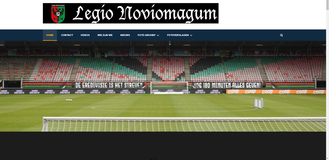
    When I upload a header image the image is a little bit blurry. I made sure that the file is 1920 x 540px but immediately after uploading, so in the image library, WordPress shows me that my image is 1024 by 288px. How can I resolve this issue of my image occurring blurry?

    Also my logo in my upper header is shown a bit blurry.

    Kind regards,
    Sjors

    #283217
    Skandha
    Participant

    @nimmasjors: Hello Sjors,
    Can you please post in your site URL so that I can look into the issue?

    Kind Regards,
    Skandha

    #283259
    NimmaSjors
    Participant

    Hi Skandha,

    The URL is: https://legio-noviomagum.nl/1610033755991/ but I am working with the free WP-staging plugin and if I’m right it’s not possible to share the site with you. Please let me know if I actually can. The site https://legio-noviomagum.nl is the current site which I want to updatewith to Chique construction theme.

    I’m not sure if it’s useful for you but here is a screenshot of what the staging site looks like with the blurry images that I mentioned in my previous post:
    Screenshot of frontpage with blurry headers

    When you see the logo you can tell why I want the background of the upper header to be black :D.

    Kind Regards,
    Sjors

    #283282
    Skandha
    Participant

    @nimmasjors: Hello Sjors,
    Go to => Appearance => Customize => Additional CSS and add the following CSS Code.

    #masthead {
        background-color: #000 !important;
    }

    Let me know if this what you want!
    Kind Regards,
    Skandha

    #283463
    NimmaSjors
    Participant

    Hey Skandha,

    Thanks again for your help! This wasn’t actually the answer to the question I meant, but it is still helpful since I wanted the background to be black anyway :).

    My problem is that both the banner image and the upper banner image (the logo) aren’t shown in full quality (this is better visible by opening the image in a new tab and then zoom in on it). They both appear a bit blurry. I don’t know why this happens. Do you have any idea how to resolve this?

    Kind Regards,
    Sjors

    #283478
    Skandha
    Participant

    @nimmasjors: Hello Sjors,
    The logo image looks fine at my end. Can you please attach a screenshot of the issue so that I can look into it?

    Kind Regards,
    Skandha

Viewing 8 posts - 1 through 8 (of 8 total)
  • The topic ‘Adjust color top header Chique construction’ is closed to new replies.