Forum Replies Created
-
AuthorPosts
-
stefanomoret
ParticipantHi,
Thanks for your reply. Maybe I did not explain my point clear enough.
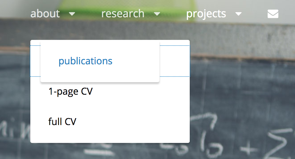
I have no problem with the fact that the submenu remains open until I click if that’s how you designed it. My problem was that, after clicking on a given subitem (such as “1-page CV”), i.e. during the “focus”, the menu was moving to another position (see my image above, the menu moved from left to right!).
I think I find a fix with the code below. What do you think? Is it correct?@media screen and (min-width: 64em) { .primary-menu li:hover .sub-menu, .primary-menu li.focus .sub-menu{ left:unset !important; right:20px !important; width:200px !important; } }stefanomoret
ParticipantThanks again Skandha.
Your proposed solution works fine on Safari. Unfortunately, the problem I mentioned above still exists for Chrome. To reproduce it, you can do the following:– open the website https://www.stefanomoret.com on google chrome
– go on the menu “about” and open a subitem (e.g. “CV 1-page”) in a new tab
– while the dropdown menu is still open, move the mouse to the right sideYou will see something weird as this:

Also, the same modification wouldn’t work on Internet explorer on Windows for example.
Any hint?
Thanks again,
Stefanostefanomoret
ParticipantAdditionally, I just noticed a weird behaviour. If you click on a submenu item (e.g. “in a nutshell”), after clicking the menu gets pushed to the right hand side again. Would be great if you could indicate the solution for this.
Thanks again for your time.stefanomoret
ParticipantThanks again!
1. True, I will keep that in mind. I have also hidden the search icon as I don’t need it, but if I add it again, I will use that code.
2. Your code pushes the menu to the right. I would like to push it to the left. Additionally, I want the size to be reduced from 268px to 200px. So I edited your code like this:
/* align dropdown menu to the right */
@media screen and (min-width:1024px) {
	.primary-menu li {
		position:relative !important;
	}
	.primary-menu li:hover .sub-menu {
		position:absolute !important;
		left: -100% !important;
		right: 15% !important;
	}
}
The “about” menu is exactly what I want. However, the other two submenus (e.g. projects) are larger. Adding
width: 200px !important;to the code above does not do the work. The width is correctly reduced, but the “projects” submenu starts still on the left from the same point you see now. Tried quite a bit to make it work, but can’t figure out a proper way.
Thanks again!
Stefanostefanomoret
ParticipantThank you for your answer.
3. works fine
1. works partially. It pushes the menu to the right hand side, but not fully. This code works instead:
/* push menu to the right */
@media screen and (min-width: 64em) {
	#primary-menu-wrapper {
		position: absolute;
		float: right;
		left: 100;
		right: 0;
		overflow: inherit;
	}
}
Is it correct?
2. does not work. Adding this code as “additional css” or in style.css does not change the position of the submenus (see example online).
4. Font: sure, I can upgrade to pro. Two questions: 1) if I simply upgrade the original adonis theme do I need to generate a new child or can I keep my current child (the one I am working on?); 2) Is the pro subscription roughly $55 annually? If at some point I don’t renew it, can I easily go back to the free theme?
stefanomoret
ParticipantHi, thank you for your reply.
So the website I am working on is https://stefanomoret.com.For your points:
1. I think I need to use a child theme because I need also to change other files, such as template-parts/header/site-branding.php. I think using a child theme is recommended when you make various changes, correct?2. What you see online is the Adonis parent theme, where I modified the CSS to push the upper menu to the right + made other changes. My plan is now to apply the same changes to the child theme and to revert my changes to the parent theme, so that the parent is brought back to the original Adonis. The problem is that if I add the code I posted above to the child theme (to push the menu to the right) it doesn’t work, while as you see it works perfectly on the parent. Can’t really figure out why. Any input here would be appreciated.
3. As you can see, I also changed the width of the dropdown menus from 248px -> 200px. However, the thing I would like to do is to align the submenus right (not left, as it is now), so they don’t go out of the page on the right hand side. I see that the part of style.css to modify for this is around l. 3764, but I can’t really get it to work.
Hope I could explain the issue clearly, and thanks a lot for your kind support!
Stefanostefanomoret
ParticipantJust to further explain the issue, adding this code to my child template style.css does not suffice, while it works just fine in the parent theme (I changed the fields “position” and “left” to push the main menu to the right):
@media screen and (min-width: 64em) {
.navigation-classic #primary-menu-wrapper .menu-inside-wrapper {
position: absolute;
display: block;
float: left;
top: 0;
left: 100;
margin: 0;
right: 0;
visibility: visible;
opacity: 1;
width: auto;
bottom: auto;
background-color: transparent;
box-shadow: none;
overflow: inherit;
} -
AuthorPosts
