- This topic has 25 replies, 2 voices, and was last updated 12 years, 3 months ago by
 Nancy.
-
AuthorPosts
-
March 12, 2014 at 12:57 am #21190
 NancyMember
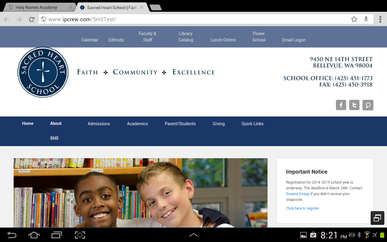
On Android devices on a 10.1 Samsung Note or on a 7″ Nook HD.
1. Menus wrap w/ Chrome and Opera and Next Browser – any way to prevent this?
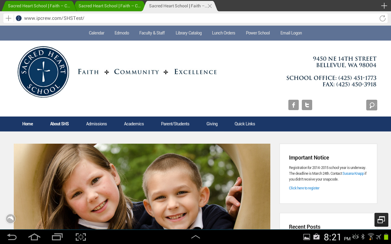
2. w/ stock browser and Dolphin, when using the social widget + Search, the search button is not next to the social icons. They are separated by what looks like the width of the search box.
March 12, 2014 at 8:07 am #21206SakinKeymaster@Nancy: Can you post your site URI and screenshot of issue?
March 12, 2014 at 9:15 am #21218NancyMemberSorry about that.
URL: http://ipcrew.com/SHSTest
Chrome Issue: http://www.ipcrew.com/SHSTest/wp-content/uploads/2014/03/ScreenshotChrome.png
Dolphin Issue: http://www.ipcrew.com/SHSTest/wp-content/uploads/2014/03/ScreenshotDolphin.png
March 12, 2014 at 10:44 am #21227SakinKeymaster@Nancy: This is really strange issue. I haven’t seen it. I checked in with chrome but don’t use Android devices. The menu item with should be flexible and shouldn’t be two line for items longer.
Can you try adding in the following CSS
#fixed-header-top ul li a, #header-menu ul.menu a, .widget_catchevolution_social_search_widget #social-search { width: auto; }March 12, 2014 at 11:15 am #21230NancyMemberNo change with the code above. The wrapping in my fixed menu on top actually looks ok. Not sure why the other menu is wrapping below and with a big gap.
March 12, 2014 at 11:26 am #21231SakinKeymaster@Nancy: So now you have menu on single line and now only issue with gap?
March 12, 2014 at 11:33 am #21233SakinKeymaster@Nancy: Can you try adding important. Your browser is taking fixed width. It’s really strange.
#fixed-header-top ul li a, #header-menu ul.menu a, .widget_catchevolution_social_search_widget #social-search { width: auto !important; }March 12, 2014 at 11:36 am #21235NancyMember@Sakin: No change. Still looks like the image I posted.
March 12, 2014 at 11:40 am #21237SakinKeymasterOk one more test. Can you click on admission page and check it. I want to check if this is issue when selecting current page.
March 12, 2014 at 11:44 am #21238NancyMemberThe “About SHS” looks correct when I select the admissions page. It’s only an issue on the home page.
The fixed menu bar wraps the same regardless of page.
March 12, 2014 at 11:55 am #21239NancyMemberAdding “!important” messes up all the menus on all platforms. The menu boxes are all different sizes and not all the items appear on the correct lines.
(Website development definitely has gotten more complicated with all the different devices, different OS’s and screen sizes!)
March 13, 2014 at 12:06 am #21265SakinKeymaster@Nancy: Can you try adding in the following.
#header-menu #access ul.menu li, #header-menu #access ul.menu li a {
    display: inline-block;
}
March 13, 2014 at 2:02 am #21280NancyMemberNo difference.
March 13, 2014 at 9:23 am #21299SakinKeymaster@Nancy: Ok now let’s try to reduce the spaces by reducing the padding. The following css will change from 20 to 15. I hope this will fix it. Your browser is taking static width for the menu item and this is strange.
#header-menu ul.menu a { padding: 0 15px; }March 13, 2014 at 10:21 am #21301NancyMemberGoogled chrome android menu issues and found a solution. Added the following:
#header-menu ul.menu a { white-space: nowrap; }
#fixed-header-top ul.menu a { white-space: nowrap; }to solve the problem.
The last Android issue I am having is with Dolphin and the social media search box is not next to the FB, Twitter icons.
Dolphin Issue: http://www.ipcrew.com/SHSTest/wp-content/uploads/2014/03/ScreenshotDolphin.png
March 13, 2014 at 11:26 am #21302NancyMemberEnded up removing the code above. My menus no longer wrapped in other cases when they needed too. Is there anyway to just apply it to the top level menus and not sub menus?
March 13, 2014 at 7:09 pm #21317SakinKeymaster@Nancy: If that is white-spaces issues then you can add the following CSS in “Appearance => Theme Options => Custom CSS” box.
#fixed-header-top ul li a, #header-menu ul.menu a { white-space: nowrap; }
#fixed-header-top ul.menu ul li a, #header-menu ul.menu ul li a { white-space: normal; }
March 14, 2014 at 9:57 am #21335NancyMemberThat works perfect. Thank you!
Any ideas on the social media icon/search issue on the dolphin browser?
March 16, 2014 at 1:27 am #21420SakinKeymaster@Nancy: Don’t have that browser to test. You can try adding in the following CSS.
#sidebar-header-right .widget_catchevolution_social_search_widget .social-profile {
    display: block;
    width: 90px;
}
March 16, 2014 at 5:59 am #21429NancyMemberLooks the same. It looks like blank space between the icons is the same width as the search box that pops out when you click the button. If I look really carefully, the “S” from the default search text is on right hand side of the search icon. When I click on the icon, the box does expand out and look correct though it is missing the default search text.
-
AuthorPosts
- The topic ‘Android Browser Issues’ is closed to new replies.