 We’re all on the lookout for new and exciting things all the time. And generally, websites staying faithful to the same look for longer than 3 years gets a bit too stagnant. We’re well aware that ours had gone overdue for 4 years too long and we seriously needed an overhaul. Therefore, we present to you our new website design that gives a completely clean, sleek and beautiful new look to Catch Themes.
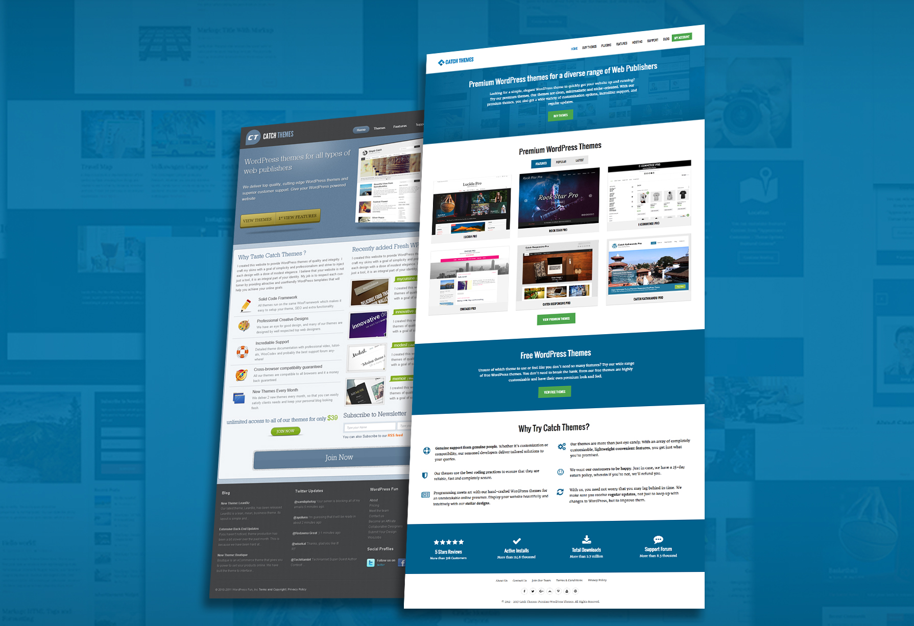
We’d had the idea of revamping our site for more than quite a few months, around the beginning of 2016 to be exact. However, the idea took some time to materialize. We thought of so many different designs and it was no easy task. Finally, on Tuesday, November the 15th, we pulled the trigger. We rolled a soft launch to see everything was running well and to allow us the time to work through any issues that might arise. We’ve worked out most of the crimps and are happy to share with you our new website design that we believe highly enhances user-friendliness.
The designing process wasn’t really what took the most time, it was finalizing on which design to go with. We designed and redesigned for more than a couple times. Once we settled on the concept, with not much changes made to placements of menus and buttons, all it took was just over a month for the technicalities to complete. We decided not to make so many changes in the way the website was laid out, we didn’t want our visitors and customers to be confused as to what lay where. That is why, we stuck with the same places for the menu buttons.
What’s new in our new website design?
We chose the royal blue against white for the color scheme as it is a color that represents calm, security, trust and confidence. We want our visitors to feel completely relaxed and soothed as they maneuver through our website. We opted to keep the structure same while simply beautifying the appearance.
You must have seen the logo itself is new. It is an inverse style logo designed with our company initials. At first look, many may see just the C, some just the T, or both if you’re really observant. We’ve tried to incorporate a style of modern art to our logo while keeping it right in alignment with our color scheme.
We’ve used brand font to make it look cleaner while making it look more pleasing to the viewer’s eye. All we were aiming for was an elegant look that made it feel and look serene.
We have increased our screen area from a 960 pixel grid to a 1600 pixel grid that gives extra screen space. It works exceptionally well through all devices ranging from small screen smartphones to large screen monitors. We’ve focused more on brand elements and everything you need most is visible right away.
Our new website design has well placed categories and you’ll find just the features of the theme you looked at clearly described. We’ve focused more on brand elements as we’ve quite established ourselves on the market with your support and trust in us. You’ll find a new belt dedicated to statistics, ratings and testimonials.
Closing Thoughts
This is our first release and we’re still modifying the contents of the website slowly. We had the same website for 4 years in a row and we’ve finally completed the much needed makeover. We hope you like our new website design. We’re open to suggestions as we’re still experimenting with new stuff. Looking forward to hearing your thoughts. Please feel free to leave us your comments. It is you and your priceless support that keeps us driving forward.